Ideal Visualization Structure

There are three core elements at the heart of great visualization. Message, Appeal, and Focus. The best communicators know how to harness these elements to create meaning and compel action.
Clear Message
The first step in finding your “message” is to choose the real point you are trying to make. Don't just use a chart because you used it in your last report. Think about what you are trying to convince your audience of. Then, provide sufficient context to bring this point to life without being overwhelming. It’s about sharing enough context without being too complex. Let’s say I had two options to make this point (left or right):
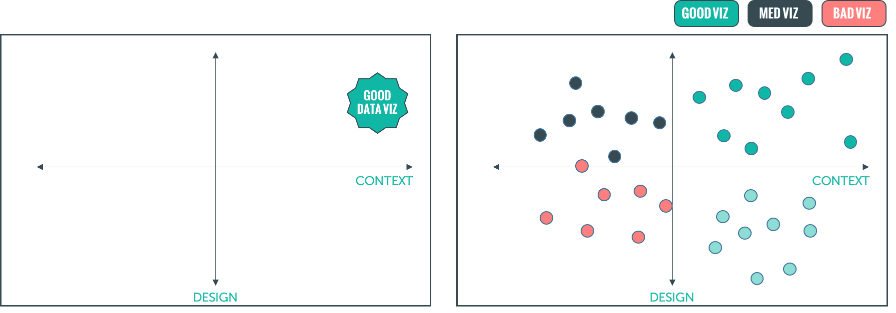
Which is better? The one on the left is pretty simple… great visualization is as much about design as it is about context (In other words… I’d rather have decent design with clear context, than great design without any context).
The one on the right tries to make the same point, but probably took you a little longer to understand. We have to interpret the key at the top, plus, now there is a lighter shaded green color that our brains have to make sense of. Our minds might wander and start to think about what makes the black dots black? Are the dots showing a trend? The message can easily get clouded by data.
Visual Appeal
Great visualizations also need to be visually appealing and attractive. We need to realize that our clients are living in a world that is full of really cool-looking information. The daily news, Instagram/FB stories, and other videos that clients are seeing in the real world are visually impressive and engaging. Our competition as researchers is not just other research firms, but all the information (attractive and not attractive) that our clients see every day.
Plus, first impressions matter. Our work is judged by how it looks (not just what we say). If you have a report that is visually confusing or unattractive, it makes you look bad. I would never show up to a client presentation with a pair of cut-off shorts and my hair a mess. So why would I send them a report that might come off as visually messy or unattractive?
Additionally, having a visually attractive design helps communicate the actual research findings better. It is less distracting, which boosts understanding. It also avoids confusion and fatigue, which, let’s face it, can set in pretty early when you are clicking through a 100 page PPT report. Don’t worry though! Visually appealing design is not too hard to achieve in your report. Here are some simple tips:
Have solid hierarchy (focus on the main thing you want to say)
Keep a clean layout (lots of good white space, don't crowd your page)
Make sure everything is nicely aligned and balanced
Use a few good colors and easily understandable fonts
Thats it! These simple elements will help bring your message to life.
Intentional Focus
This leads us to our last important takeaway about great visualizations. They need to have intentional focus that emphasizes the main point you want to communicate. Constantly think about how you can use specific design elements to reinforce (and highlight) your message.
You can do this with a variety of specific elements like color, size, and texture. Below are a few examples of how you can make certain parts of your data stand out:

While some of this may take some time and practice to achieve, you don’t need to be an expert designer to make more visually compelling reports. You just need to be intentional about what you want to say, avoid bad habits (like data overload, poor color choice, cramming too much information on a page), and ultimately use certain design elements to give each slide clearer meaning.