4 Graphs From 1 Simple Table

Every once in awhile when I’m in a rut, I force myself to come up with a bunch of different visualization options for a single set of data. At first its seems daunting… but if you push yourself (and you have a little time), you’ll be amazed at what you can create. Below is an example of a simple set of trended data for a hypothetical global reputation study:
Find The Story
Before you start designing anything, first find the story in the data. Did all markets change at the same rate? Were certain markets superstars and others duds? Is the trend info more important than your current performance? You need to know WHAT you want to communicate before you design anything.
Lead With Layout
Now you need to think about where and how these visualizations will be used. Do you have the vast canvas of a widescreen Powerpoint slide? Are you combining multiple graphs on a page? Is it a only small thumbnail for a newsletter report? Size matters and it will dictate how you need to constrain (or not constrain) your visualization.
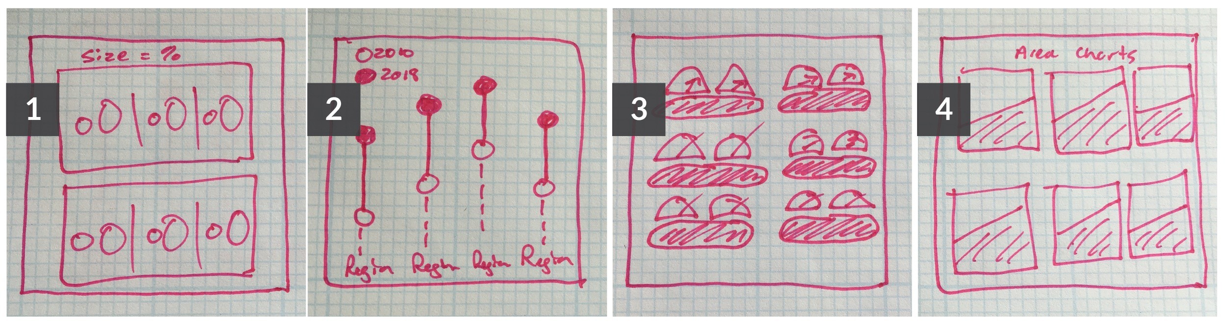
Sketch In The Rough
The next step is to sketch some rough ideas. I like to use Pen & Paper. Simple and always at my fingertips. Don’t worry about making it look good. It’s more about generating multiple ideas quickly. As you can see below, I clearly cannot draw that well… but it doesn’t stop me!
Execute Your Design
Now you are ready to actually design something. Build off your sketches with your favorite design program. Yes, even PPT can be a design program… If you can make shapes and drop in text, you have all you need. Pay careful attention to each design and give yourself some room to riff off of each design element. You’ll be surprised how executing one design will lead to a slew of other new ideas.
Here are my final four ideas from the top table. These all assume our goal was to show change in all markets evenly, allowing our audience to quickly digest our progress from 2010-2018.
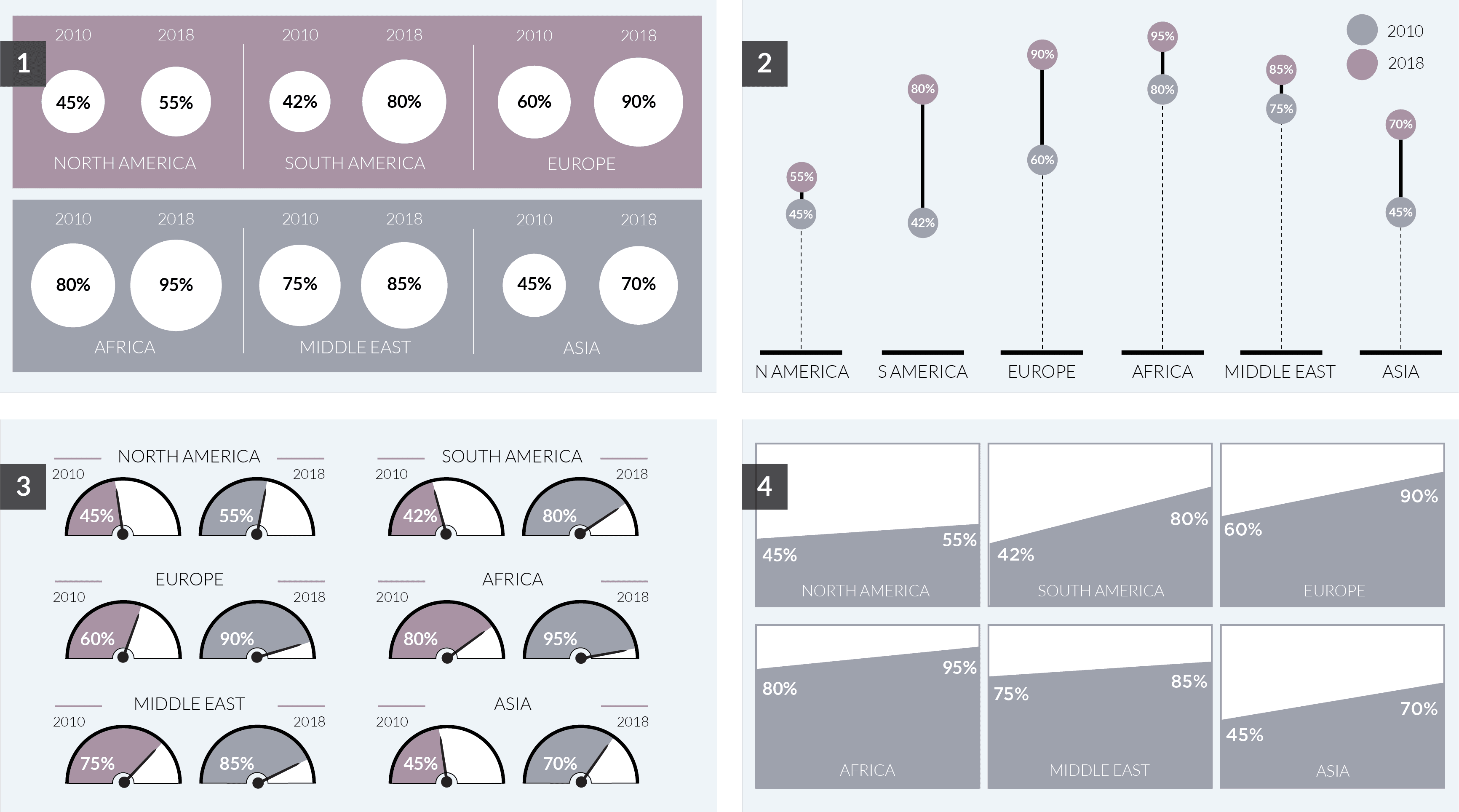
As you can see, there are several ways to visualize the same set of data. Once you have a solid design you like, make sure each future graph in your series/report follows a similar look and feel. This doesn’t mean you should use that same chart every time, but each visualization should all feel part of the same family.